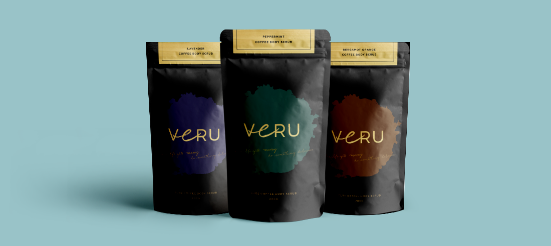
Naming, Logo and Packaging Design for Veru
Veru Body Scrub is a new product on the market that needed a fresh new brand to capture the attention of potential buyers.

The Challenge
To name a new body scrub on the market who’s primary demographic consisted of 15 – 60 year old women. The name needed to be attention grabbing and different to other direct competitors.
Our Solutions
• The name ‘Veru’ is the Maltese translation for ‘real’. Not only does it translate to the word ‘real’, but it also translates into derivatives of the words ‘perfect’, ‘true’ and ‘veracious’ – which all represent the idea of being positive, real and almost ethereal beings.
• The logo is based on a hand written font using gold for a luxurious quality. It is trustworthy, trendy, quirky & fun – the essence of the brand.
• The tagline: “Life’s messy, deal with it”, is the perfect addition to this logo.


