Top 7 Website Disasters
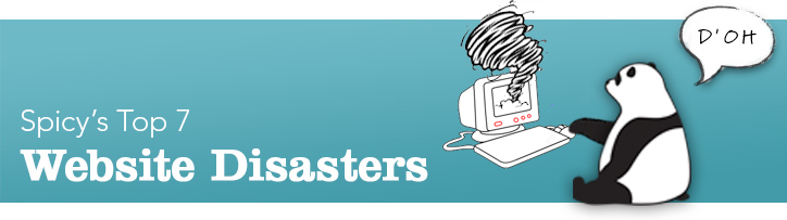
You could be losing hundreds of customers! We’ve all come across websites that drive us crazy, and Spicy Broccoli has put together a list of the worst website faux pas. Let’s talk about Top 7 Website Disasters, and how to avoid them!
We challenge you to come up with your own or comment on these suggestions in the space below the post.
1. ‘D’oh!’
We’re staring off with a few common mistakes that are most likely to make people a little hot around the collar. These ‘uh ohs’ will generally make you say, “D’oh,” from their sheer obviousness, and could have been avoided from a bit of proofreading. Not to worry, these little mistakes have easy fixes.
- Broken Links – Update these!
- Missing Images – No one wants to see that red X
- Spelling / Grammar errors – How unprofessional!
2. I’m lost, help!
If it takes more than one or two clicks to get to pertinent info on your site, your potential customer may be on to the next tab they opened from the google search. No one likes to be meandering through a website like they’re lost in the Outback. Make those sign posts easy to see. ‘1km to civilization?! Oh boy!’
- Frustrating Navigation –Where is that dang navi bar? Make your navigation bar and important links easy to find AND easy to understand. (Avoid cutesie/overly clever language in the navi; clarity should be first and foremost, be a smarty in the body text.)
- No Clear Links – Very similar to above. If you offer a product or service, make the link obvious, or else you’re costing yourself a customer.
- Contact Us – If this is an integral part of your business make it easy for customers to get in contact with you.[A debate arises with contact forms vs. email app linking. Basically, should you have an in-site contact form (content controllable, easy to filter through info, users don’t need to leave your site) or an email link that activates your users email app/program externally (users may like the flexibility/keeping a soft copy of their inquiry, however be aware spam may be an issue)? Choose which option works better with your website and needs.]
Making your user think too much with a user experience that hasn’t been well thought out is a sure way to say arrivederci to them — and their potential business.
3. Who made this?
Nothing is more embarrassing than web content that looks like your 5 year old designed it. Your website should look professional and cater to your target audience. Paying a designer for a couple of hours can go a long way – may we suggest Spicy Broccoli Media? Of course, if your website is in fact for 5 year olds, we’ll give you a bit of a pass.
- Images & Graphics – Related to your content, and high-res (expandable/multiple views especially if you’re a product based business). Also, let’s avoid obvious stock/watermarked images – that’s just tacky!
- Colours – Try to keep a limited colour pallet, nothing too eye-hurting or seizure inducing, as well aiming to contrast between important and less important items.
- Fonts – Usually your site’s first impression. Keep cutesie/hard to read fonts to your love letters, and make font colour and sizes legible. (Bonus: resizable font is a plus for older users.)
4. My, how annoying!
These additions may seem fun to you, but tend to drive users crazy. Avoid users jumping ship, and leaving your site, by excluding the following from your ship ledger.
- Auto play music/videos – It’s rather disconcerting to be bombarded by music and people talking at you, when you first view a website. If music adds to your website’s overall experience, try giving it a delayed or quiet start, and make sure the off button is very obvious if people aren’t feeling your groove. With videos, let users decide if they’d like to give them a watch or not, just make that play button obvious.
- Long entry animations / loading screens – Avoid making users wait to visit your website. You run the risk of users clicking away before you have a chance to wow them; most of us prefer instant gratification.
- Link colours – Not exactly a ‘fun addition’, as it is a lack of one. This point is more a user ease of functionality thing – change visited link colours so users know where they’ve been.
5. Stop being so cryptic!
Traversing a site for information or products and coming up empty is the worst. Make sure to lay it all out on the table so users leave feeling more informed.
- Clear, concise info – Web users are goal-driven, most of us visit sites with a specific need in mind, whether it be info or product. Make your information easily located and with as much detail as necessary. FAQs and product details are good ways to start.
- Prices – Nothing is more annoying than prices not being advertised on product related websites. If you’d like users to buy your product, you should probably let them know how much it is.
6. You’re putting me to sleep! Remember the all important WIIFM.
Yes, yes, yes, I see you do exactly what I think you do, but WIIFM? What’s in it for me!? Don’t bore your users to death. Most people are skimmers and scanners when reading, and subconsciously look out for items that stand out.
- Text Walls – Scrolling down to see a text wall coming at you can be daunting. Hard enters are your friend, as are bolding/italicizing/underling important points, and using bullets or numbering to break stuff up.
- Make it pop – Use colour, typography, and graphics (ahem, that’s where we come in to help) to draw the eye to important areas around the website. However, be aware less is more – toomanyflashyitems can be distracting, and there’s a fine line between making something noticeable and making it look like a banner/side ad – which users have trained themselves to ignore.
- Using visual hierarchy is the best way to help people easily navigate around your site.
- Get feedback before you launch and remember you may not always be your target audience – so ask them!
7. Opt-In?
This last point is a little more geared towards you, the creator/business owner, rather than what is annoying for users. However, users do have something to say about it, as they usually do, and views tend to be drawn down the middle.
- You – For you, an email opt-in is a big positive, especially if you are a product based or regularly updated information site. It’s a great way to legally/voluntarily get user’s email address, to be able to reach them at a later date.Product wise, users may not want to buy up front; being able to remind them of your products later on through a newsletter is great, as well as updating them about future products. Information is similar – if you can let them know about updates, they’re more likely to come back.
- Them – User views on email opt-ins are divided, as we said. Some may be for it, and would like to be reminded or updated about products/info at a later date. However, others may not like the first thing they see to be a pop-up opt-in, and additionally may not want the updates.Try to see what works/is needed for your business and users. Perhaps have a pop-up opt-in that’s easy to x-out of, or instead have a noticeable button on the site, letting users decide if they’d like to join a mail-out or not.
Bonus! CMS’s, in other words – the system (S) on how you manage (M) your content (C)
Here’s an extra point from us to you. Consider the basis of your website before you start designing. Proprietary CMS vs Open Source can be a big difference when it comes to updating in the future.
Proprietary CMS tends to be a self-contained site, and harder to update. If you part ways with the company that designed your site, you might run into problems in the future because they still own the IP to the back end of the site and the portals for logging in.
Open Source platforms are commonly used around the world. They are easier to update yourself, or by different designers if you need a change. (Spicy Broccoli use open source platforms, so it must be good!)
The latest stats on Wordpress – our preferred CMS:
- WordPress is a free and open source tool and a content management system (CMS) based on PHP and MySQL.[5]
- Features include a plugin architecture and a template system that’s available if you don’t go down the route of using fabulous designers.
- WordPress was used by more than 22.0% of the top 10 million websites as of August 2013.[6]
- WordPress is the most popular blogging system in use on the Web,[7] at more than 60 million websites.[8]
Hopefully we’ve helped you avoid making these faux pas in the future.
What things drive you crazy when browsing the web? Let us know below in the comments!