Logo Design Northern Beaches, What’s hot in local branding trends on Sydney’s Northern Beaches
We surf before work, skate on lunch breaks, The Spicy Broccoli Media Headquarters is located in Manly Vale, close to the beach and even closer to many amazing local businesses. We don’t just work here either! This is our home.
The importance of knowing your local community and what is happening on the street is what allows us to give our clients a competitive advantage. These trends that influence our lives every second move so fast you need to be eyes wide open, observing, considering where to next.
Here in Spicy Land we’ve offered complete brand development and web design services required to establish your unique presence in your marketplace. Whether you are starting a new business, or your current brand needs a facelift, our Northern Beaches graphic design gurus can help with all aspects of your business brand development. Here are a couple of our favourite branding and logo projects we have completed on the Northern Beaches. Questions already? Contact us by clicking here!
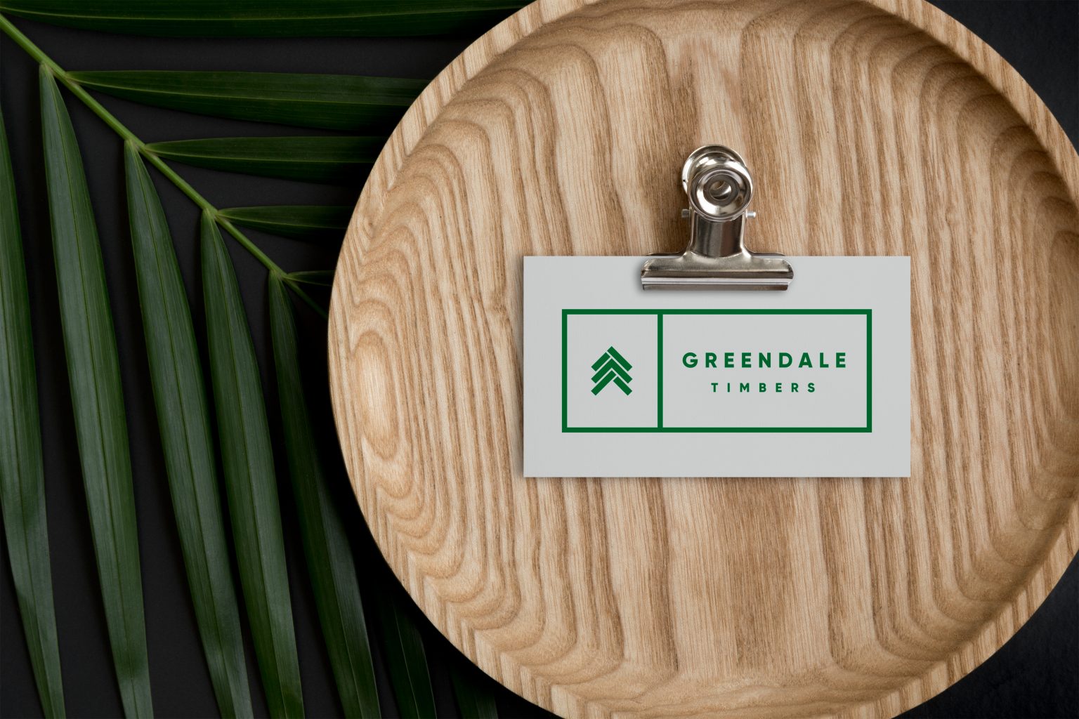
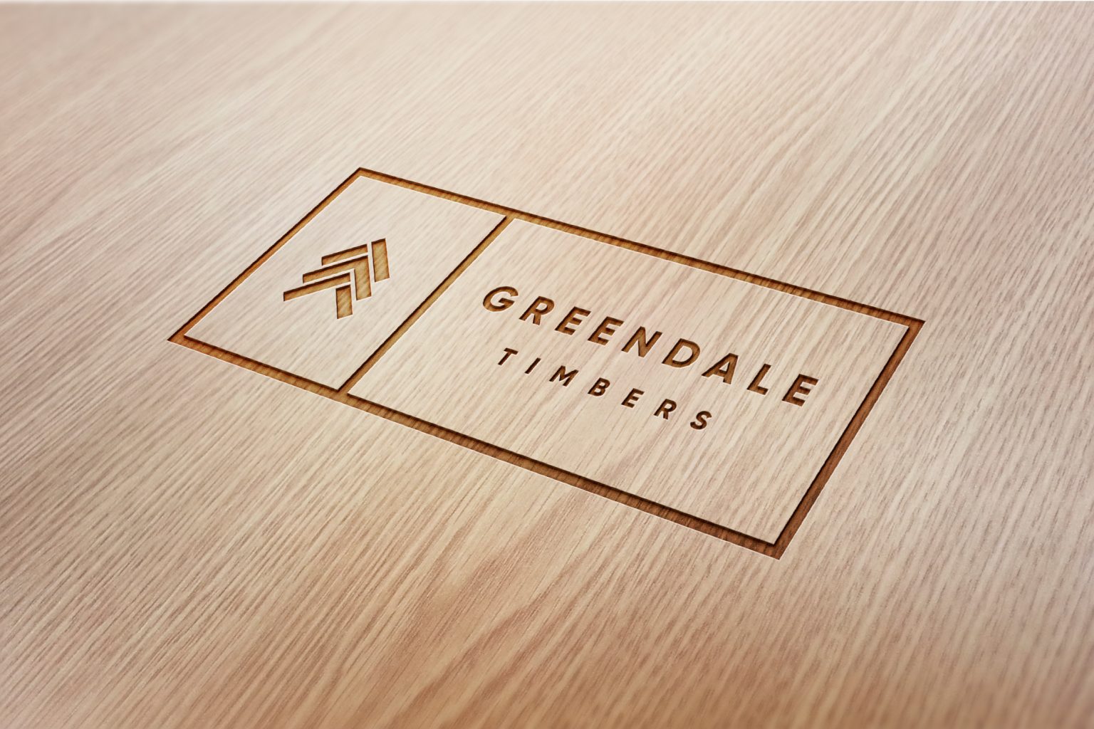
Greendale Timbers – flat design
Greendale Timbers’ logo is an abstract presentation of the Norfolk Pine tree iconic in the Northern Beaches combined with an arrow in the middle, which implies positiveness and movement. The choice of colour palette has also been created to reflect the nature of the Northern Beaches Pines in mind, reflecting Spicy’s importance on a localised approach to branding.
To ensure Spicy are keeping up to date with upcoming design trends in the 2019 forecast we have been consistently practicing our flat design as seen in Greendale’s branding. Flat design doesn’t mean that everything is reduced down to two dimensions — it’s all about minimalism and usability. It’s a design aesthetic that gets rid of clutter and focuses on the important parts of your website. Utilising bright colours, clean and crisp edges, and lots of open space, flat design is a refreshing change from distracting and slow-loading hi-res image-based designs. Creative Director in Spicy Land Sarah explains this concept perfectly, “In spite of being minimalist, this doesn’t mean that flat design is boring. Contrasting bright colours and illustration with simple imagery and basic typography, the sum of flat design’s parts comes together to provide an excellent user experience that is eye-catching and engaging”.
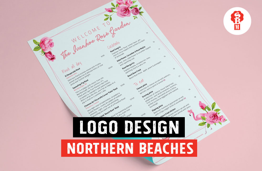
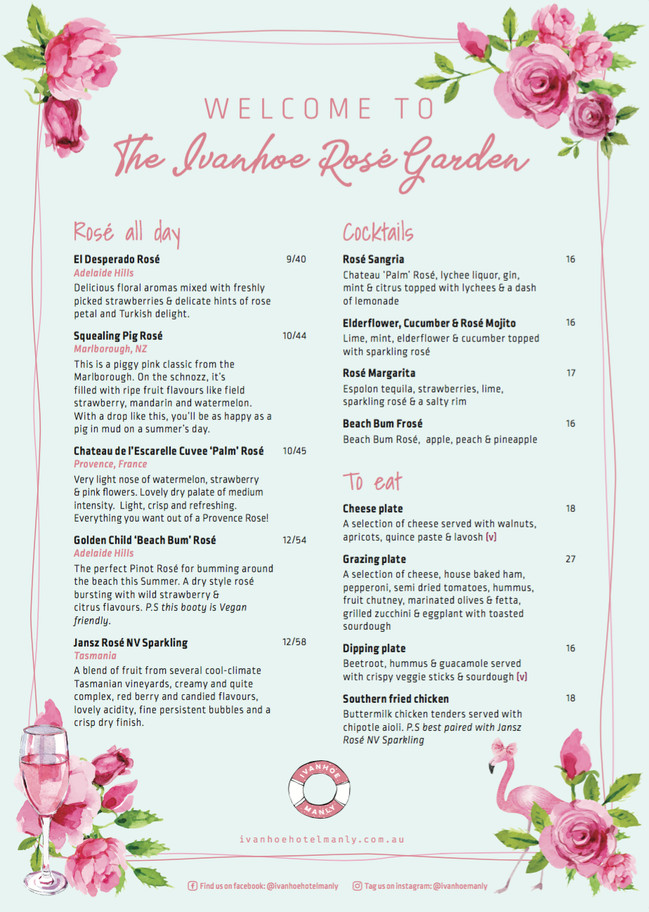
Ivanhoe Rosé Gardens – pastels and texture
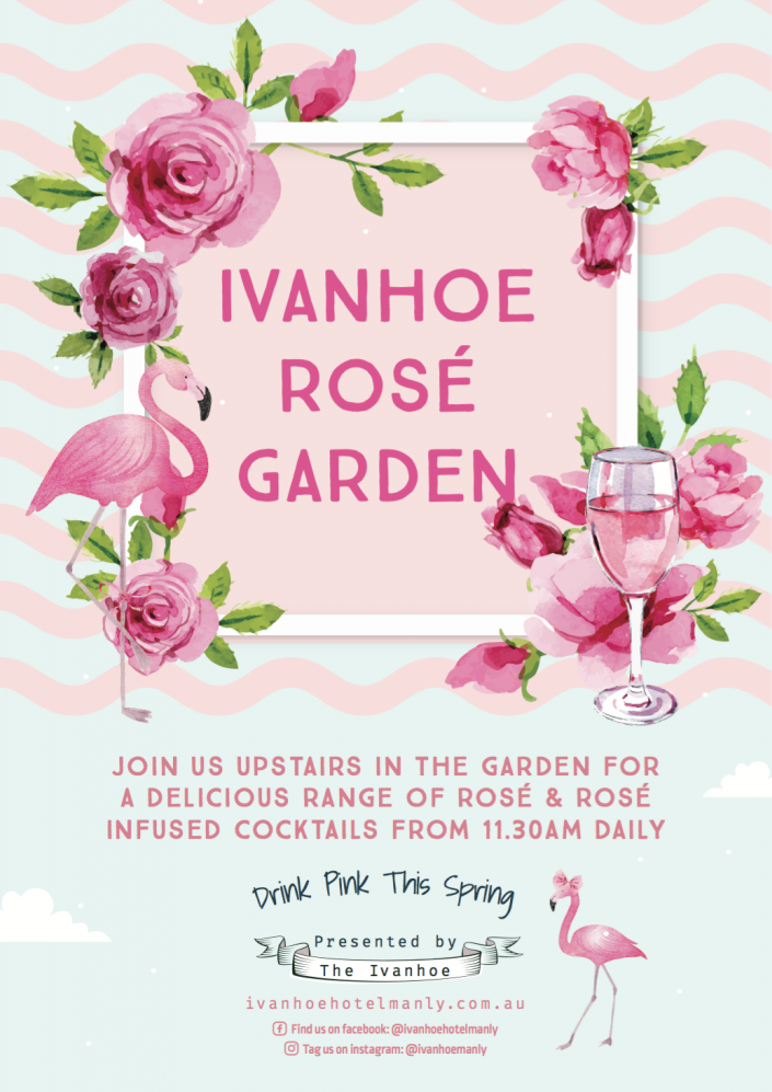
To welcome in Spring, we created an internal branding strategy for Ivanhoe’s new pop up Rosé Garden. This new event was focused on showcasing some of Ivanhoe’s favourite Rosé by the glass & bottle alongside a delicious range of Rosé Cocktails; all served to the public in a lush tropical garden oasis… think flamingos, banana leaf & floral bouquets! “This event was successfully aimed towards women through the fresh, fun and floral consistent theming and was effectively tied into the season of Spring” says Sarah Creative Director at Spicy Broccoli Media Headquarters. Here in Spicy Land we are dedicated to providing memorable and successful brand activations that don’t just communicate but they connect. Executed with authenticity, it’s an immersive, holistic, humanistic experience that appeals to a new type of consumer: one who is willing to spend a little time getting to know the brands they’re considering. As a creative agency of the future we know people are much more interested in collecting memories rather than stuff. We are increasingly realising that experiences, not consumption, drive lasting well-being and brand health. In order to win our consumers hearts, we realise the importance of providing them with a unique and engaging experience that will resonate with these sensibilities, as seen through Ivanhoe’s Rosé internal branding strategies created by us.
Sandy Bottoms Guest House – line drawings and script fonts
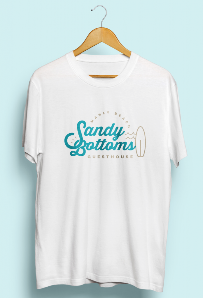
The Sandy Bottoms Guest House logo “is a combination of handwritten typography and iconic features of the lifestyle by the sea” as outlined by Creative Director Sarah at Spicy Broccoli. The Sandy Bottoms Guest House colour palette has been created to further reflect the spirit of the sand and water. Colours convey messages, evoke emotions, and add brilliance to everyday things so we believe that this will always stay in our future branding strategies as humans love colour and always will… plus they can never deny a tug on the heart strings. The inclusion of the waves in The Sandy Bottoms Guest House hotel logo design mirror the establishment’s coastal Northern Beaches location and reinforces the calming motif you will experience when staying at this Guest House. Professional, modern, linked to the location, and illustrating the journey of recharging away from routine, the Manly logo design project was for a fun one.
Do you have an awesome business on the Northern Beaches? Want to talk real live graphic designers who get the local vibe? Drop into our headquarters and let’s chat!
P: 02 8084 5554
A: 1/71 Kenneth Road, Manly Vale 2093
Speak soon,
