Get your graphic design game-face on

They say design speakers louder than words. From what type of font you need to use to the smallest alignment adjustment, the creative process of graphic design can be a long and strenuous process. If you’re a graphic design freshie looking to sharpen your skills, you’re going to want to read our graphic design tips that everyone should know!
1. For font sake, keep it simple.
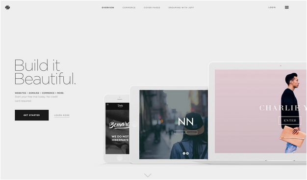
*Squint… I can’t read that font. You don’t what to be in that sticky situation where people can’t read what you write. That’s why when selecting a typeface or font for headings, subtitles and body text, make sure you use fonts that are simple and easy to read. Our poor ageing eyes find it straining if we had to look at multiple typefaces. Our favourite simple fonts include Gotham and Avenir with the perfect modern aesthetic for the modern man.
2. The Simple Life
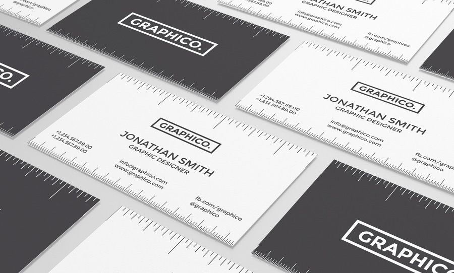
If Paris Hilton can try to live the simple life, you can too. In the graphic designing world, less is definitely more. So get rid of those bright pink tracksuits and tone it down a notch with minimalistic fonts, colours and shapes. Use contrasting tonal colour combinations that are easy to read and sharp. Having a solid frame to align your texts will hugely improved your readability and thus… likability… *drops microphone.
3. White Noise
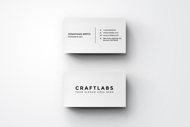
Don’t be afraid of the white spaces surrounding words. Take a step back and let your elements breathe for a second. Using space around images, graphic elements and text boxes also make a design a lot easier to read. No onewants a cluttered composition, so embrace the space you’ve been given and get that graphic design game on sister!
4. Fonts have feelings too
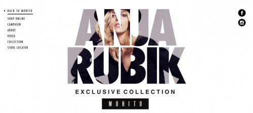
Abraham Lincoln once said that font is like a mascot for graphic designers. Okay… maybe he didn’t say that, but this tip is still very important even if it didn’t come out of the mouths of a famous leader. Choose the right typeface that joins in holy matrimony with your content. Using rounded edged font makes it more friendly and cheeky, whereas solid and strong fonts convey a more sophisticated look.
5. Perfect alignment
Pivot…. Pivot…PIVOT! Yes, it’s frustrating when you have to continually move the elements just 0.1mm to the left. But trust us, that little smidge makes a HUGE difference! Apply a line or an embellishment to for design balance and composition. Extra spicy tip: turn your smart guide/ruler settings on Photoshop to be the ultimate alignment god!
6. Feeling moody
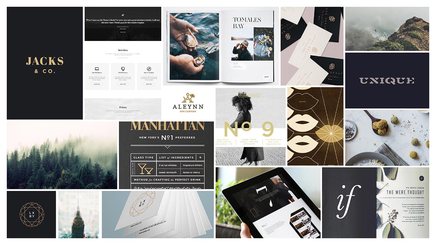
Declutter your mind and set up easy mood boards that contain collections of colour swatches and images that inspire your piece. Choose a common colour palette that you love and utilise the inspiration to your day to day designs. This is an awesome opportunity to imitate and create your favourite artwork and adapt it to make it you!
Or tip number 7 you can contact us for some graphic design tasks!
Let’s chat! Contact us today at info@spicybroccoli.com
Speak soon,
The Broccoli Army
