Top 5 Web Trends forecast for 2014
What’s new for 2014? What’s happening? What’s hot? What’s as old school as RUN DMC*?
We are constantly researching local and global markets, competition for each of our clients, and keeping a continuous eye on web trends. We developed 16 websites in 2013. We have 2 project managers, 3 designers and 2 developers in house. If each person researched 20 websites per design, that’s a minimum of 2,240 of websites researched in 2013 alone.
Just for you, trusty reader, here we discuss the top 5 trends for website design and development that will help us this year in creating our unique, memorable, super spicy solutions for our clients.
1. Evolution of Flat Design to Layered Design
Apple – with it’s iOS 7 release, pioneered a new design trend dubbed by designers as ‘Layered Design’. Layered Design uses flat design elements to form a foundation for its visuals, but then uses semi-transparent layers to add depth.
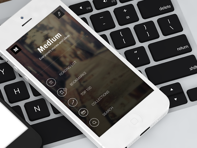
2. Large Hero images replace sliders
Large hero areas (the “intro” area, often an image with a little amount of text, at the top of a website – a borrowed term from print design) on website home pages are running rampant. With either a simple blurred photo in the background with a heading centered in the middle, hero areas are quickly replacing sliders as the new attention-grabbers, and they are becoming increasingly creative and elaborate.
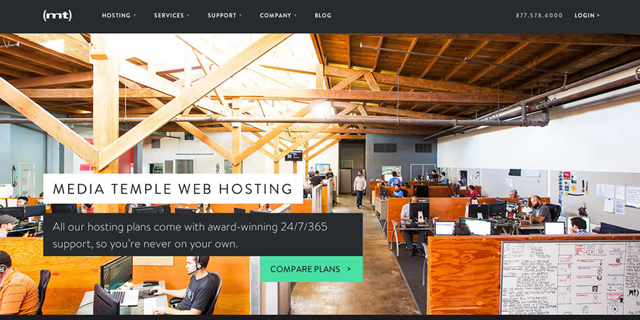

3. Filtered Background images
While it is easy to just throw any old photo on your site, it is a little more difficult to manipulate it into something different. In 2014, we will see more images that have things such as color overlays, blurred images, or even images that are reminiscent of Instagram images with filters.


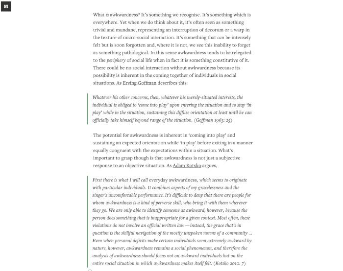
4. Dropping of Sidebar to simplify layout
This is more for blog or magazine-type sites, but many of these sites are experimenting with dropping the sidebar all together. This allows for a more visual impact with content (and easier responsive Web development).
Imagine this: you reading an article without things flashing, crowding, or otherwise buying for your attention. Designers understand this and are working to make your reading experience more pleasant by getting rid of these distractions and expanding the content of the article to take over the page. Not sure about you, but this is a welcome change and a trend that we hope is here to stay.
5. Mobile First Responsive Design
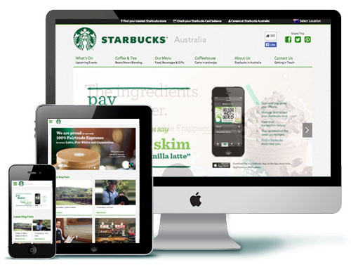
Now that Responsive Web Design is becoming more commonplace, we are starting to see websites dig deeper into our mobile lifestyles. Mobile First Responsive Design begins first with the mobile and then is enhanced progressively as the browser size increases. Rather than designing for desktop and regressively removing elements for mobile. Designers are increasingly working on keeping their sites functioning on mobile devices, but developers are taking it a step further to help along with the fact that so many more devices are accessing the Web, and so many more users are using their phones to browse the Web.
What we’ve started doing is creating wireframes of the site, and once that’s approved, a wireframe for the mobile site if it’s important for it to be responsive. You can see an example here.
* Adrian’s Dad introduced him to Run DMC, that’s how old school they are.