Menu Template Tips and Tricks!
Which one are you?
Do you go to your favourite restaurant and order the same meal every time or do you meticulously analyse every dish until you are sure on your choice, only to blurt out another dish when it’s your turn to order?
Or maybe you just order whatever you please, when you please.
It doesn’t matter which scenario described you because they all have something in common…
the menu.
Menu Design and furthermore template construction is such an important attribute to your hospitality business. It acts a guide for your customers and is often the first place potential customers will visit when researching your business. Here at Spicy Headquarters, we love food so it comes as no surprise that we have mastered the art of creating the perfect menu template. A recipe for success we are keen for you to try!
EYE SPY A GREAT TIP COMING YOUR WAY…
According to behavioural economics, an individual will read a menu in the following pattern:
This is often referred to as the ‘triangle of sight’ and it should influence where you position the dishes you want to ensure your customers are drawn to. For example placing your signature dishes in the upper right hand section of your menu will ensure they are not skipped over.
Bold typography is also crucial to help certain dishes/ sections of your menu stand out. Think wisely about your font, it needs to be clear and easily readable. Nothing ruins a high-quality dining experience than a misunderstanding of what you are purchasing, so leave no room for confusion. Keep it clear, simple and neat.
GIVE YOUR COLOURING A CLUE..
Colours are so important for setting the tone of your business and establishing the mood of your venue. Using bright colours suggests fresh, fast paced services. Where as deeper tones can enhance romantic energies and evening settings.
- Green often suggests freshness
- Orange is proven to stimulate the appetite
- Yellow evokes happiness (also very eye catching)
- Red encourages action
The most important thing to note about colour is the area where you use none. This negative space can be used to ground your customer and often acts as a highlighting tool. Data shows that items with the greatest profit margins are often located in their own negative space.
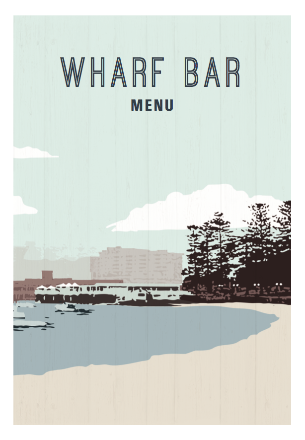
Have a look at our latest menu for Wharf Bar Hotel Manly.
POSITIONING is poignant
We have three hot tips for how you decide to order and position your finest dishes.
- Limited choice is a good thing! Ever heard of the burden of choice?
- Data analyse shows that customers usually go with one of the top two selections in each category, so ensure you lead with your best foot.
- Decoy dishes don’t exist. Don’t put anything on your menu you would not be proud to serve to your mother because then your customers won’t be impressed by it either.
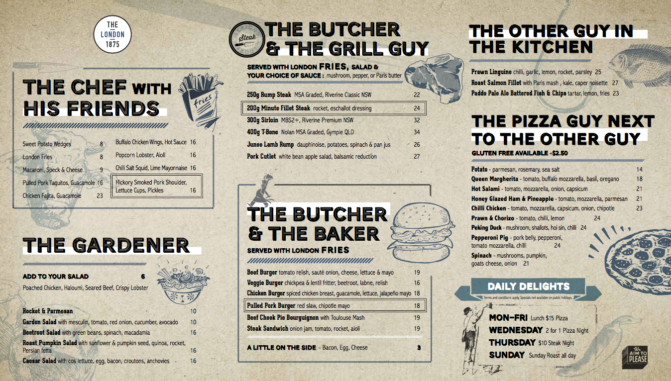
Check out the positioning on The East London Menu design we created.
PERFECT PRICING
Now we come to the only downfall of dining out for your customer, paying the bill.
To try not to remind them of this fact we suggest avoiding using currency symbols on your menu. Stick to plain numbers, I’m sure they’ll understand what it means. Your customer just dosesn’t want dollar signs scattered all over the menu to remind them of the few dollars they have to spend on this meal.
Don’t line your prices up along the edge of the menu vertically or horizontally or your customers will shop by price, which isn’t ideal.
Stick to nice whole numbers, this lends an air of sophistication to your menu.
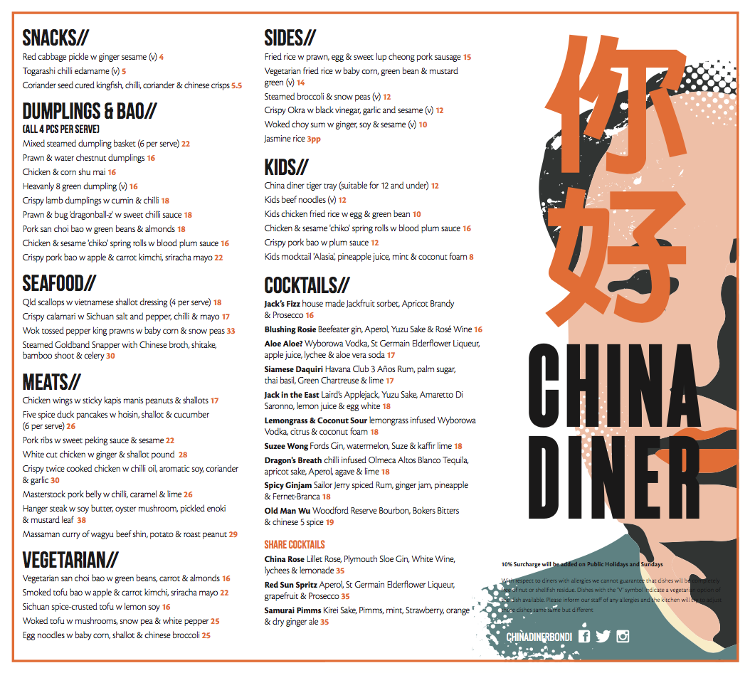
For example look at the China Dinner Menu we created for inspiration!
KEEPING YOUR CUSTOMERS COMFORTABLE
Nostalgia is a powerful emotion, by creating a carefully worded description you can evoke an emotional response in your customer, making their experience much more memorable.
Longer descriptions of your dishes will give the customer greater insight into your food. People are often scared to try new things so by illuminating their understanding of your dish you are more likely to encourage them to step out of their comfort zone and try something new.
A glossary is a great tool on your menu. Similarly to a good description, it helps educate your customer further on your menu to ensure there is no confusion or lack of understanding. This empowers your customer to make their own informed choices, making their experience in your venue more enjoyable for them.
The material your menu is made out of will communicate your brand image, so don’t skip out on the higher quality feel.
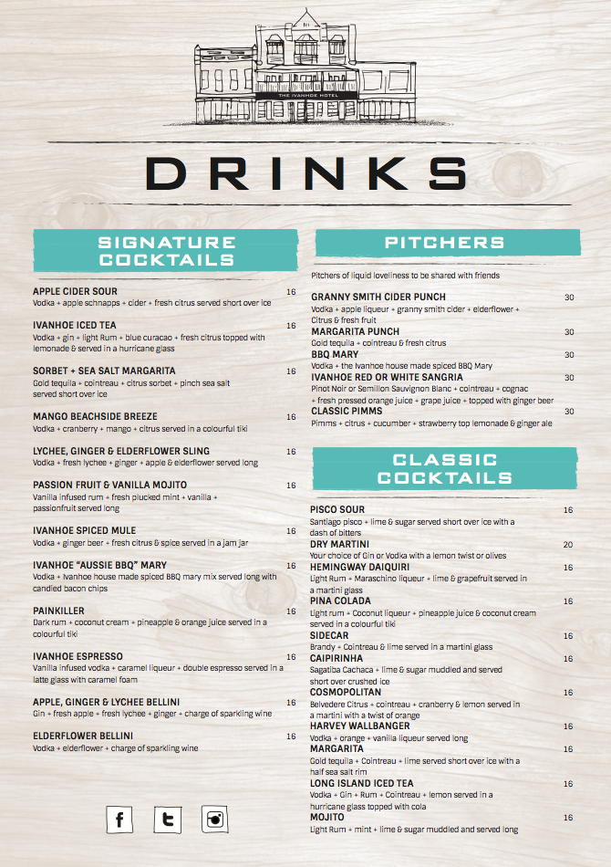
Take a look at our work on the Ivanhoe Hotel Menu.
INTERESTING IMAGES
When inserting images into your menu be very careful. These images can make or break a dish, so don’t rush into it. Once an image is on the menu for a dish all replicas must be identical and anything that slightly fails to live up to the picture will leave your customer feeling like your kitchen hasn’t given their full effort and care into creating this dish.
On another note, just having one image can go one of two ways; it can either accentuate that dish and increase it’s consumption or it can look weird and out of place.
To avoid all of this we suggest considering illustration as a happy medium.
If after all these tips your menu is still lacking flavour, give us a shout and we will help you add some spice!
Contact us today at info@spicybroccoli.com
Speak soon,
The Broccoli Army
