Hot Tips for Logo Design

A logo is the foundation and heart and soul of your brand. It is not only your company’s first impression, but it has the power to determine customer’s brand perception and overall attitudes towards your product. Our team at Spicy understand this importance and want to share our hot tips for fantastic logo design.
Flexibility is key

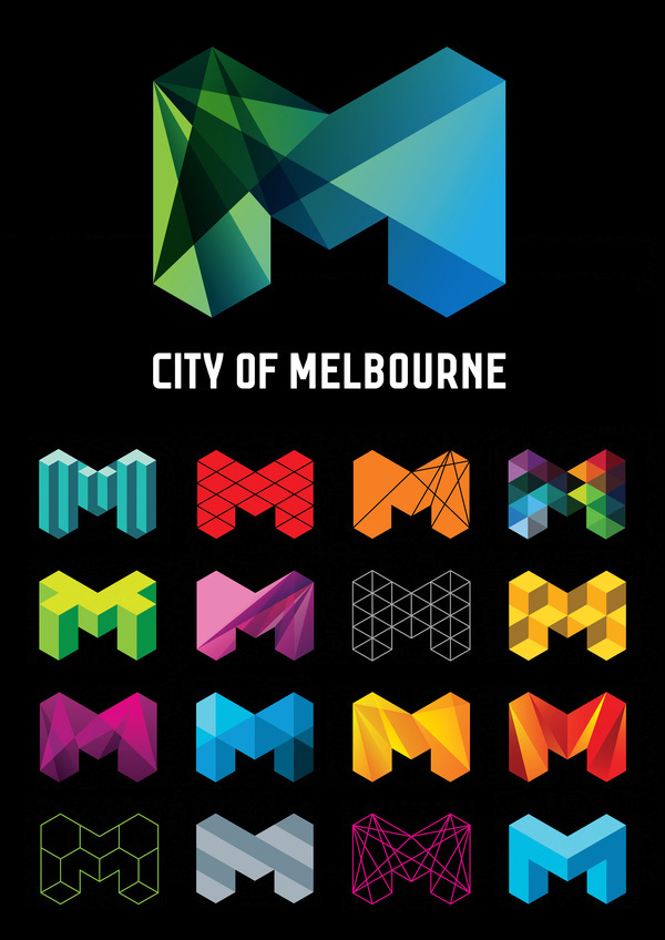
A favourite chameleon of ours is the City of Melbourne logo by Landor. ‘The brand system resists the traditional thinking about identity design, instead embracing the idea of modulation and adaptation’ (Little, 2010). The constant M shape paired with changing imagery allowed the CoM brand to unite a range of different governing bodies. With a future-focused image which is both flexible and unified, the cost-effectiveness of brand management was also improved! Hot, hot, hot spicians!
Remember the promise
The definition of the brand is “A Promise” .. a promise to what the business will deliver, what the expectations will be, what the customer can get excited about. The logo is the inception piece to this journey — it’s where all pieces of communication begin. This interplays with the font you choose to represent your business, and a palette of colours that execute the overall concept of the business. To start the conversation with the audience, it first begins with how your logo or brand image can create customer feelings and connections with your brand.

Colour speaks all languages
Colours have the ability to affect feelings and emotions. Most colours have a universal understanding to everyone. Ideally, your choice of colour should be made on the basis of the target demographic of customers (Business Insider, 2014). Consider the age, gender and cultural orientations of the target audience, and couple it with your artistic creativity, and you’ve got a killer colour palette for your logo already!

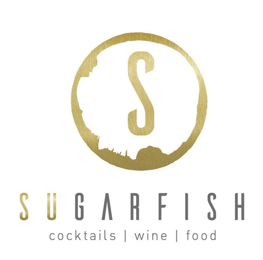
The latest cool kid of the spicy book is Sugarfish by Garfish Seafood @ Manly. Flowing out to their new deck, Sugarfish features its own share plate menu as well as a sophisticated cocktail menu. This is why we spiced the simplistic logo with a textured gold colour scheme to reflect the luxury and sophistication that our client wanted to represent. Gold is a universal colour that is often associated with wealth and grandeur. To not over exaggerate the brands promise, we muted the vibrancy with textured layers to make it more suitable to Sugarfish.
Want to add that extra spice to your logo?
Say hello today!
We look forward to speaking to you soon.
Until next time,
The Broccoli Army
